 About my projects, examples and tutorials

GnomeTools::Gtk::Dialog
Description
This module is used to setup a dialog window. It is made as a convenience and because it will be deprecated in Gtk version 5.
The contents of the dialog is a grid. The first column is used for a label to describe what is in the next columns. At the bottom is a row where buttons are placed. Optionally there is a status line below the row of buttons.
The dialog is modal by default.
Example
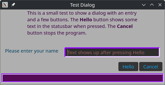
Example use of the class GnomeTools::Gtk::Dialog.
method make-dialog ( ) {
  my Str $dialog-header = Q:a:to/EOHEADER/;
    This is a small test to show a dialog with an entry
    and a few buttons. The <b>Hello</b> button shows some
    text in the statusbar when pressed. The <b>Cancel</b>
    button stops the program.
    EOHEADER

  with my Gnome::Gtk4::Entry $entry .= new-entry {
    .set-placeholder-text('Text shows up after pressing Hello');
    .set-size-request( 400, -1);
  }

  with my GnomeTools::Gtk::Dialog $dialog .= new(
    :$dialog-header, :dialog-title('Test Dialog'), :add-statusbar
  ) {
    .add-content( 'Please enter your name', $entry);
    .add-button( helper.new, 'say-hello', 'Hello', :$dialog, :$entry);
    .add-button( $dialog, 'destroy-dialog', 'Cancel');
  }
}
…
method say-hello (
  GnomeTools::Gtk::Dialog :$dialog,
  Gnome::Gtk4::Entry :$entry
) {
  say "hello $entry.get-text()";
  $dialog.set-status("hello <b>$entry.get-text()\</b>");
}
…
Css
The Css classes defined for the GnomeTools::Gtk::Dialog are; dialog-tool, dialog-header, dialog-content, and dialog-button.
When the following code is added to method make-dialog() defined above;
  my GnomeTools::Gtk::Theming $theme .= new(:css-text(Q:q:to/EOCSS/));
  .dialog-tool {
    background-color: #afafaf;
  }

  .dialog-header {
    color:rgb(59, 1, 65);
    padding-left: 15px;
    padding-right: 15px;
  }

  .dialog-content label {
    color: #004060;
  }

  .dialog-button label {
    color:rgb(15, 165, 240);
  }

  .statusbar-tool {
    background-color:rgb(84, 10, 85);
    border-width: 5px;
    border-style: groove;
    border-color:rgb(144, 0, 255);
  }

  .statusbar-tool > label {
    color:rgb(0, 0, 90);
  }

  .dialog-entry {
    border-width: 5px;
    border-style: inset;
    border-color:rgb(144, 0, 255);
    color:rgb(255, 141, 141);
  }

  EOCSS

  $theme.add-css-class( $entry, 'dialog-entry');
The status bar has its own css classes as is shown in the code. Also the emtry widget got a class dialog-entry. The result shows like;
Methods
new
Create a GnomeTools::Gtk::Dialog.
submethod BUILD (
  Str :$dialog-header = '',  Str :$dialog-title = '',
  Bool :$add-statusbar = False, Gnome::Gtk4::Window :$transition-window?,
  Int :$width = 400, :$height = 100, Bool :$modal = True
)
$dialog-header; A small text placed at the top of the dialog.
$dialog-title; A string placed in the windows decoration bar.
$add-statusbar; A statusbar can be placed at the bottom of the dialog. Not shown by default.
$transition-window; Make the dialog depending on another window. This is useful that the dialog also is destroyed when the $transition-window is removed.
$width; The width of the dialog.
$heaght; The width of the dialog.
$modal; Specifies that other windows cannot get focus when $modal is True. Turned on by default.
add-content
Content is added to the dialog. There is always a label on the left and a user defined widget on the right.
method add-content ( Str:D $text, *@widgets, Int :$columns = 1, Int :$rows = 1 )
$text; The text shown on the left
*@widgets; One or more widgets placed horizontally
$columns; The number of columns each widget needs. By default 1.
$rows; The number of rows each widget needs. By default 1.
An example use
This example shows how to add some content to the dialog.
$dialog.add-content(
  'Please enter your name',
  my Gnome::Gtk4::Entry $entry .= new-entry;
);
add-button
Add a button to the button row at the bottom of the dialog. It is right justified and filled right to left.
method add-button ( Mu $object, Str $method, Str $button-label, *%options )
$object; The object where method is defined.
$method; The name of the method. The method is called after pressing the button.
$button-label; The text on the button
*%options; Any options provided to the method when called.
An example use
An example of two buttons. The first expects two named arguments $dialog and $entry. The second button destroys the dialog by calling $dialog.destroy-dialog().
  $dialog.add-button( $helper, 'say-hello', 'Hello', :$dialog, :$entry);
  $dialog.add-button( $dialog, 'destroy-dialog', 'Done');
set-status
When the statusbar is visible, you may use this method to show some text in it. Previous shown text is removed.
method set-status ( Str $message )
$message; The message to display
show-dialog
When everything is placed in the dialog, show-dialog() can be called to show the dialog on screen.
method show-dialog ( )
destroy-dialog
When dialog isn't needed anymore, call destroy-dialog().
method destroy-dialog ( )