Understanding Text
 To use text effectively you need to know where it will go. The methods
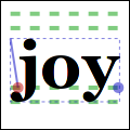
 font-extents() and text-extents() get you this information. Since this diagram is hard to see so small. It shows the relation between the reference point (red dot); suggested next reference point (blue dot); bounding box (dashed blue lines); bearing displacement (solid blue line); and height, ascent, baseline, and descent lines (dashed green).
The reference point is always on the baseline. The descent line is below that, and reflects a rough bounding box for all characters in the font. However it is an artistic choice intended to indicate alignment rather than a true bounding box. The same is true for the ascent line above. Next above that is the height line, the artist-recommended spacing between subsequent baselines. All three of these are reported as distances from the baseline, and expected to be positive despite their differing directions.
The bearing is the displacement from the reference point to the upper-left corner of the bounding box. It is often zero or a small positive value for x displacement, but can be negative x for characters like j as shown; it’s almost always a negative value for y displacement. The width and height then describe the size of the bounding box. The advance takes you to the suggested reference point for the next letter. Note that bounding boxes for subsequent blocks of text can overlap if the bearing is negative, or the advance is smaller than the width would suggest.
In addition to placement, you also need to specify a face, style, and size. Set the face and style together with select-font-face(), and the size with set-font-size(). If you need even finer control, try getting a Gnome::Cairo::FontOptions with get-font-options(), tweaking it, and setting it with set-font-options().