Gnome::Gtk4::PopoverMenu
Description
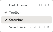
Gnome::Gtk4::PopoverMenu is a subclass of Gnome::Gtk4::Popover that implements menu behavior.

Gnome::Gtk4::PopoverMenu treats its children like menus and allows switching between them. It can open submenus as traditional, nested submenus, or in a more touch-friendly sliding fashion. The property flags controls this appearance.
Gnome::Gtk4::PopoverMenu is meant to be used primarily with menu models, using .new-from-model(). If you need to put other widgets such as a Gnome::Gtk4::SpinButton or a Gnome::Gtk4::Switch into a popover, you can use .add-child().
For more dialog-like behavior, use a plain Gnome::Gtk4::Popover.
Menu models
The XML format understood by Gnome::Gtk4::Builder for Gnome::Gio::MenuModel consists of a toplevel `<menu>` element, which contains one or more `<item>` elements. Each `<item>` element contains `<attribute>` and `<link>` elements with a mandatory name attribute. `<link>` elements have the same content model as `<menu>`. Instead of `<link name="submenu">` or `<link name="section">`, you can use `<submenu>` or `<section>` elements.
Attribute values can be translated using gettext, like other Gnome::Gtk4::Builder content. `<attribute>` elements can be marked for translation with a translatable="yes"` attribute. It is also possible to specify message context and translator comments, using the context and comments attributes. To make use of this, the Gnome::Gtk4::Builder must have been given the gettext domain to use.
The following attributes are used when constructing menu items:
"label": a user-visible string to display
"use-markup": whether the text in the menu item includes [Pango markup](https://docs.gtk.org/Pango/pango_markup.html)
"action": the prefixed name of the action to trigger
"target": the parameter to use when activating the action
"icon" and "verb-icon": names of icons that may be displayed
"submenu-action": name of an action that may be used to track whether a submenu is open
"hidden-when": a string used to determine when the item will be hidden. Possible values include "action-disabled", "action-missing", "macos-menubar". This is mainly useful for exported menus, see .set-menubar() in class Application.
"custom": a string used to match against the ID of a custom child added with .add-child(), .add-child() in class PopoverMenuBar, or in the ui file with `<child type="ID">`.
The following attributes are used when constructing sections:
"label": a user-visible string to use as section heading
"display-hint": a string used to determine special formatting for the section. Possible values include "horizontal-buttons", "circular-buttons" and "inline-buttons". They all indicate that section should be displayed as a horizontal row of buttons.
"text-direction": a string used to determine the
enumeration GtkTextDirection defined in Gnome::Gtk4::T-enumsto use when "display-hint" is set to "horizontal-buttons". Possible values include "rtl", "ltr", and "none".
The following attributes are used when constructing submenus:
"label": a user-visible string to display
"icon": icon name to display
Menu items will also show accelerators, which are usually associated with actions via .set-accels-for-action() in class Application, [method $WidgetClass.add_binding_action] or .add-shortcut() in class ShortcutController.
CSS Nodes
Gnome::Gtk4::PopoverMenu is just a subclass of Gnome::Gtk4::Popover that adds custom content to it, therefore it has the same CSS nodes. It is one of the cases that add a `.menu` style class to the main popover node.
Menu items have nodes with name button and class `.model`. If a section display-hint is set, the section gets a node box with class horizontal plus a class with the same text as the display hint. Note that said box may not be the direct ancestor of the item buttons. Thus, for example, to style items in an inline-buttons` section, select `.inline-buttons button.model`. Other things that may be of interest to style in menus include label nodes.
Accessibility
Gnome::Gtk4::PopoverMenu uses the GTK_ACCESSIBLE_ROLE_MENU role, and its items use the GTK_ACCESSIBLE_ROLE_MENU_ITEM, GTK_ACCESSIBLE_ROLE_MENU_ITEM_CHECKBOX or GTK_ACCESSIBLE_ROLE_MENU_ITEM_RADIO roles, depending on the action they are connected to.
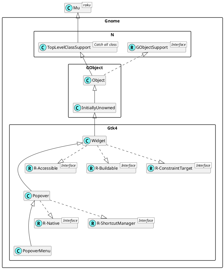
Uml Diagram

Class initialization
new
:native-object
Create an object using a native object from an object of the same type found elsewhere. See also Gnome::N::TopLevelSupportClass.
multi method new ( N-Object() :$native-object! )
new-from-model
Creates a Gnome::Gtk4::PopoverMenu and populates it according to $model.
The created buttons are connected to actions found in the Gnome::Gtk4::ApplicationWindow to which the popover belongs - typically by means of being attached to a widget that is contained within the Gnome::Gtk4::ApplicationWindows widget hierarchy.
Actions can also be added using .insert-action-group() in class Widget on the menus attach widget or on any of its parent widgets.
This function creates menus with sliding submenus. See .new-from-model-full() for a way to control this.
method new-from-model ( N-Object() $model --> Gnome::Gtk4::PopoverMenu )
$model; a Gnome::Gio::MenuModel.
new-from-model-full
Creates a Gnome::Gtk4::PopoverMenu and populates it according to $model.
The created buttons are connected to actions found in the action groups that are accessible from the parent widget. This includes the Gnome::Gtk4::ApplicationWindow to which the popover belongs. Actions can also be added using .insert-action-group() in class Widget on the parent widget or on any of its parent widgets.
method new-from-model-full ( N-Object() $model, UInt $flags --> Gnome::Gtk4::PopoverMenu )
$model; a Gnome::Gio::MenuModel.
$flags; flags that affect how the menu is created.
Methods
add-child
Adds a custom widget to a generated menu.
For this to work, the menu model of $popover must have an item with a custom attribute that matches $id.
method add-child ( N-Object() $child, Str $id --> Bool )
$child; the Gnome::Gtk4::Widget to add.
$id; the ID to insert
$childat.
Return value; True if $id was found and the widget added.
get-flags
Returns the flags that $popover uses to create/display a menu from its model.
method get-flags (--> UInt )
Return value; the bit field GtkPopoverMenuFlags defined in Gnome::Gtk4::T-enums.
get-menu-model
Returns the menu model used to populate the popover.
method get-menu-model (--> N-Object )
Return value; the menu model of $popover.
remove-child
Removes a widget that has previously been added with .add-child()()
method remove-child ( N-Object() $child --> Bool )
$child; the Gnome::Gtk4::Widget to remove.
Return value; True if the widget was removed.
set-flags
Sets the flags that $popover uses to create/display a menu from its model.
If a model is set and the flags change, contents are rebuilt, so if setting properties individually, set flags before model to avoid a redundant rebuild.
method set-flags ( UInt $flags )
$flags; a set of
bit field GtkPopoverMenuFlags defined in Gnome::Gtk4::T-enums.
set-menu-model
Sets a new menu model on $popover.
The existing contents of $popover are removed, and the $popover is populated with new contents according to $model.
method set-menu-model ( N-Object() $model )
$model; a Gnome::Gio::MenuModel.
 About my projects, examples and tutorials