Gnome::Gtk4::Button
Description
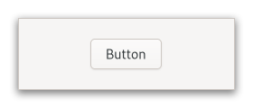
The Gnome::Gtk4::Button widget is generally used to trigger a callback function that is called when the button is pressed.

The Gnome::Gtk4::Button widget can hold any valid child widget. That is, it can hold almost any other standard Gnome::Gtk4::Widget. The most commonly used child is the Gnome::Gtk4::Label.
CSS nodes
Gnome::Gtk4::Button has a single CSS node with name button. The node will get the style classes .image-button or .text-button, if the content is just an image or label, respectively. It may also receive the .flat style class. When activating a button via the keyboard, the button will temporarily gain the .keyboard-activating style class.
Other style classes that are commonly used with Gnome::Gtk4::Button include .suggested-action and .destructive-action. In special cases, buttons can be made round by adding the .circular style class.
Button-like widgets like Gnome::Gtk4::ToggleButton, Gnome::Gtk4::MenuButton, Gnome::Gtk4::VolumeButton, Gnome::Gtk4::LockButton, Gnome::Gtk4::ColorButton or Gnome::Gtk4::FontButton use style classes such as .toggle, .popup, .scale, .lock, .color on the button node to differentiate themselves from a plain Gnome::Gtk4::Button.
Accessibility
Gnome::Gtk4::Button uses the GTK_ACCESSIBLE_ROLE_BUTTON role.
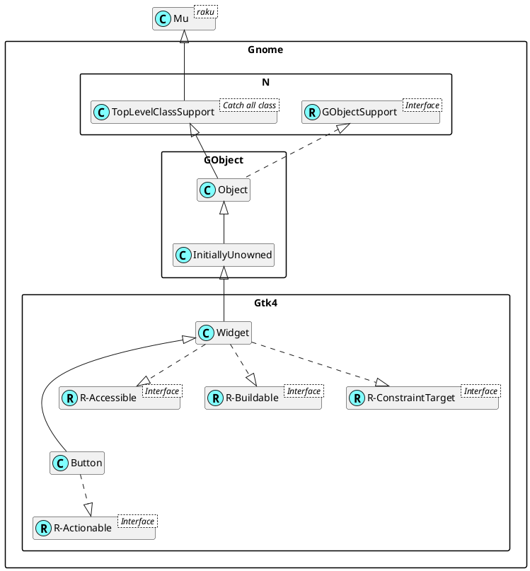
Uml Diagram

Class initialization
new
:native-object
Create an object using a native object from an object of the same type found elsewhere. See also Gnome::N::TopLevelSupportClass.
multi method new ( N-Object() :$native-object! )
new-button
Creates a new Gnome::Gtk4::Button widget.
To add a child widget to the button, use .set-child().
method new-button ( --> Gnome::Gtk4::Button )
new-from-icon-name
Creates a new button containing an icon from the current icon theme.
If the icon name isn’t known, a “broken image” icon will be displayed instead. If the current icon theme is changed, the icon will be updated appropriately.
method new-from-icon-name ( Str $icon-name --> Gnome::Gtk4::Button )
$icon-name; an icon name.
new-with-label
Creates a Gnome::Gtk4::Button widget with a Gnome::Gtk4::Label child.
method new-with-label ( Str $label --> Gnome::Gtk4::Button )
$label; The text you want the Gnome::Gtk4::Label to hold.
new-with-mnemonic
Creates a new Gnome::Gtk4::Button containing a label.
If characters in $label are preceded by an underscore, they are underlined. If you need a literal underscore character in a label, use “__” (two underscores). The first underlined character represents a keyboard accelerator called a mnemonic. Pressing <kbd>Alt</kbd> and that key activates the button.
method new-with-mnemonic ( Str $label --> Gnome::Gtk4::Button )
$label; The text of the button, with an underscore in front of the mnemonic character.
Methods
get-can-shrink
Retrieves whether the button can be smaller than the natural size of its contents.
method get-can-shrink (--> Bool )
Return value; true if the button can shrink, and false otherwise.
get-child
Gets the child widget of $button.
method get-child (--> N-Object )
Return value; the child widget of $button.
get-has-frame
Returns whether the button has a frame.
method get-has-frame (--> Bool )
Return value; True if the button has a frame.
get-icon-name
Returns the icon name of the button.
If the icon name has not been set with .set-icon-name() the return value will be undefined. This will be the case if you create an empty button with .newbutton() to use as a container.
method get-icon-name (--> Str )
Return value; The icon name set via .set-icon-name().
get-label
Fetches the text from the label of the button.
If the label text has not been set with .set-label() the return value will be undefined. This will be the case if you create an empty button with .newbutton() to use as a container.
method get-label (--> Str )
Return value; The text of the label widget. This string is owned by the widget and must not be modified or freed..
get-use-underline
gets whether underlines are interpreted as mnemonics.
See .set-use-underline().
method get-use-underline (--> Bool )
Return value; True if an embedded underline in the button label indicates the mnemonic accelerator keys..
set-can-shrink
Sets whether the button size can be smaller than the natural size of its contents.
For text buttons, setting $can-shrink to true will ellipsize the label.
For icons and custom children, this function has no effect.
method set-can-shrink ( Bool() $can-shrink )
$can-shrink; whether the button can shrink.
set-child
Sets the child widget of $button.
Note that by using this API, you take full responsibility for setting up the proper accessibility label and description information for $button. Most likely, you'll either set the accessibility label or description for $button explicitly, or you'll set a labelled-by or described-by relations from $child to $button.
method set-child ( N-Object() $child )
$child; the child widget.
set-has-frame
Sets the style of the button.
Buttons can have a flat appearance or have a frame drawn around them.
method set-has-frame ( Bool() $has-frame )
$has-frame; whether the button should have a visible frame.
set-icon-name
Adds a Gnome::Gtk4::Image with the given icon name as a child.
If $button already contains a child widget, that child widget will be removed and replaced with the image.
method set-icon-name ( Str $icon-name )
$icon-name; An icon name.
set-label
Sets the text of the label of the button to $label.
This will also clear any previously set labels.
method set-label ( Str $label )
$label; a string.
set-use-underline
Sets whether to use underlines as mnemonics.
If true, an underline in the text of the button label indicates the next character should be used for the mnemonic accelerator key.
method set-use-underline ( Bool() $use-underline )
$use-underline;
Trueif underlines in the text indicate mnemonics.
Signals
activate
Emitted to animate press then release.
This is an action signal. Applications should never connect to this signal, but use the clicked signal.
The default bindings for this signal are all forms of the <kbd>␣</kbd> and <kbd>Enter</kbd> keys.
method handler (
  Int :$_handle_id,
  N-GObject :$_native-object,
  Gnome::Gtk4::Button :$_widget,
  *%user-options
)
$_handle_id; The registered event handler id.
$_native-object; The native object provided by the Raku object which registered this event. This is a native Gnome::Gtk4::Button object.
%user-options; A list of named arguments provided by .register-signal() in class Object.
clicked
Emitted when the button has been activated (pressed and released).
method handler (
  Int :$_handle_id,
  N-GObject :$_native-object,
  Gnome::Gtk4::Button :$_widget,
  *%user-options
)
$_handle_id; The registered event handler id.
$_native-object; The native object provided by the Raku object which registered this event. This is a native Gnome::Gtk4::Button object.
%user-options; A list of named arguments provided by .register-signal() in class Object.
 About my projects, examples and tutorials