 Interfacing Raku to Gnome GTK+
Gnome::Gtk3::ButtonBox
A container for arranging buttons
Description
A button box should be used to provide a consistent layout of buttons throughout your application. The layout/spacing can be altered by the programmer, or if desired, by the user to alter the “feel” of a program to a small degree.
get-layout() and set-layout() retrieve and alter the method used to spread the buttons in a button box across the container, respectively.
The main purpose of GtkButtonBox is to make sure the children have all the same size. GtkButtonBox gives all children the same size, but it does allow ‘outliers’ to keep their own larger size.
To exempt individual children from homogeneous sizing regardless of their ‘outlier’ status, you can set the non-homogeneous child property.
Css Nodes
GtkButtonBox uses a single CSS node with name buttonbox.
Synopsis
Declaration
unit class Gnome::Gtk3::ButtonBox;
also is Gnome::Gtk3::Box;
Uml Diagram

Inheriting this class
Inheriting is done in a special way in that it needs a call from new() to get the native object created by the class you are inheriting from.
use Gnome::Gtk3::ButtonBox;

unit class MyGuiClass;
also is Gnome::Gtk3::ButtonBox;

submethod new ( |c ) {
  # let the Gnome::Gtk3::ButtonBox class process the options
  self.bless( :GtkButtonBox, |c);
}

submethod BUILD ( ... ) {
  ...
}
Example
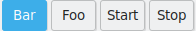
The below example creates a ButtonBox with 4 buttons. The result is shown in the picture at the start of this document.
my Gnome::Gtk3::ButtonBox $bb .= new;
$bb.set-layout(GTK_BUTTONBOX_EXPAND);

my Gnome::Gtk3::Button $button1 .= new(:label<Start>);
$bb.add($button1);
my Gnome::Gtk3::Button $button2 .= new(:label<Stop>);
$bb.add($button2);

my Gnome::Gtk3::Button $button3 .= new(:label<Foo>);
$bb.add($button3);
$bb.set-child-secondary( $button3, True);
my Gnome::Gtk3::Button $button4 .= new(:label<Bar>);
$bb.add($button4);
$bb.set-child-secondary( $button4, True);
Types
enum GtkButtonBoxStyle
Used to dictate the style that a Gnome::Gtk3::ButtonBox uses to layout the buttons it contains.
-
GTK-BUTTONBOX-SPREAD: Buttons are evenly spread across the box.
-
GTK-BUTTONBOX-EDGE: Buttons are placed at the edges of the box.
-
GTK-BUTTONBOX-START: Buttons are grouped towards the start of the box, (on the left or at the top).
-
GTK-BUTTONBOX-END: Buttons are grouped towards the end of the box, (on the right or at the bottom).
-
GTK-BUTTONBOX-CENTER: Buttons are centered in the box.
-
GTK-BUTTONBOX-EXPAND: Buttons expand to fill the box. This entails giving buttons a “linked” appearance, making button sizes homogeneous, and setting spacing to 0 (same as calling
Gnome::Gtk3::Box.set-homogeneous()andGnome::Gtk3::Box.set-spacing()manually).
Methods
new
:orientation
Create a new ButtonBox object.
multi method new ( GtkOrientation :$orientation = GTK_ORIENTATION_HORIZONTAL )
- $layout_style; the new layout style
:native-object
Create a ButtonBox object using a native object from elsewhere. See also Gnome::N::TopLevelClassSupport.
multi method new ( N-GObject :$native-object! )
:build-id
Create a ButtonBox object using a native object returned from a builder. See also Gnome::GObject::Object.
multi method new ( Str :$build-id! )
get-child-non-homogeneous
Returns whether the child is exempted from homogenous sizing.
Returns: True if the child is not subject to homogenous sizing
method get-child-non-homogeneous ( N-GObject() $child --> Bool )
- $child; a child of the button box
get-child-secondary
Returns whether $child should appear in a secondary group of children.
method get-child-secondary ( N-GObject() $child --> Bool )
- $child; a child of the button box
get-layout
Retrieves the method being used to arrange the buttons in a button box.
method get-layout ( --> GtkButtonBoxStyle )
set-child-non-homogeneous
Sets whether the child is exempted from homogeous sizing.
method set-child-non-homogeneous (
  N-GObject() $child, Bool $non_homogeneous
)
-
$child; a child of the button box
-
$non_homogeneous; the new value
set-child-secondary
Sets whether $child should appear in a secondary group of children. A typical use of a secondary child is the help button in a dialog.
This group appears after the other children if the style is GTK-BUTTONBOX-START, GTK-BUTTONBOX-SPREAD or GTK-BUTTONBOX-EDGE, and before the other children if the style is GTK-BUTTONBOX-END. For horizontal button boxes, the definition of before/after depends on direction of the widget (see gtk-widget-set-direction()). If the style is GTK-BUTTONBOX-START or GTK-BUTTONBOX-END, then the secondary children are aligned at the other end of the button box from the main children. For the other styles, they appear immediately next to the main children.
method set-child-secondary ( N-GObject() $child, Bool $is_secondary )
-
$child; a child of the button box
-
$is_secondary; if
True, the $child appears in a secondary group of the button box.
set-layout
Changes the way buttons are arranged in their container.
method set-layout ( GtkButtonBoxStyle $layout_style )
- GtkButtonBoxStyle $layout_style; the new layout style
Properties
Layout style: layout-style
How to lay out the buttons in the box. Possible values are: spread, edge-COMMA- start and end
Default value: False
The Gnome::GObject::Value type of property layout-style is G_TYPE_ENUM.
-
Parameter is readable and writable.
-
Default value is False.