 Interfacing Raku to Gnome GTK+
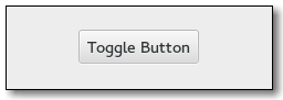
Gnome::Gtk3::ToggleButton
Create buttons which retain their state
Description
A Gnome::Gtk3::ToggleButton is a Gnome::Gtk3::Button which will remain “pressed-in” when clicked. Clicking again will cause the toggle button to return to its normal state.
A toggle button is created by calling either gtk_toggle_button_new() or gtk_toggle_button_new_with_label(). If using the former, it is advisable to pack a widget, (such as a Gnome::Gtk3::Label and/or a Gnome::Gtk3::Image), into the toggle button’s container. (See Gnome::Gtk3::Button for more information).
The state of a Gnome::Gtk3::ToggleButton can be set specifically using gtk_toggle_button_set_active(), and retrieved using gtk_toggle_button_get_active().
To simply switch the state of a toggle button, use gtk_toggle_button_toggled().
Css Nodes
Gnome::Gtk3::ToggleButton has a single CSS node with name button. To differentiate it from a plain Gnome::Gtk3::Button, it gets the .toggle style class.
See Also
Gnome::Gtk3::Button, Gnome::Gtk3::CheckButton, Gnome::Gtk3::CheckMenuItem
Synopsis
Declaration
unit class Gnome::Gtk3::ToggleButton;
also is Gnome::Gtk3::Button;
Uml Diagram

Methods
new
default, no options
Creates a new toggle button. A widget should be packed into the button, as in Gnome::Gtk3::Button.new().
multi method new ( )
:label
Create a Gnome::Gtk3::ToggleButton with a label.
multi method new ( Str :$label! )
:native-object
Create a ToggleButton object using a native object from elsewhere. See also Gnome::N::TopLevelClassSupport.
multi method new ( N-GObject :$native-object! )
:build-id
Create a ToggleButton object using a native object returned from a builder. See also Gnome::GObject::Object.
multi method new ( Str :$build-id! )
get-active
Queries a Gnome::Gtk3::ToggleButton and returns its current state. Returns True if the toggle button is pressed in and False if it is raised.
Returns: a gboolean value.
method get-active ( --> Bool )
get-inconsistent
Gets the value set by set-inconsistent().
Returns: True if the button is displayed as inconsistent, False otherwise
method get-inconsistent ( --> Bool )
get-mode
Retrieves whether the button is displayed as a separate indicator and label. See set-mode().
Returns: True if the togglebutton is drawn as a separate indicator and label.
method get-mode ( --> Bool )
set-active
Sets the status of the toggle button. Set to True if you want the Gnome::Gtk3::ToggleButton to be “pressed in”, and False to raise it. This action causes the toggled signal and the clicked signal to be emitted.
method set-active ( Bool $is-active )
- Bool $is-active;
Truefor pressed in,Falseotherwise
set-inconsistent
If the user has selected a range of elements (such as some text or spreadsheet cells) that are affected by a toggle button, and the current values in that range are inconsistent, you may want to display the toggle in an “in between” state. This function turns on “in between” display. Normally you would turn off the inconsistent state again if the user toggles the toggle button. This has to be done manually, set-inconsistent() only affects visual appearance, it doesn’t affect the semantics of the button.
method set-inconsistent ( Bool $setting )
- Bool $setting;
Trueif state is inconsistent
set-mode
Sets whether the button is displayed as a separate indicator and label. You can call this function on a checkbutton or a radiobutton with $draw-indicator = False to make the button look like a normal button.
This can be used to create linked strip of buttons that work like a Gnome::Gtk3::StackSwitcher.
This function only affects instances of classes like Gnome::Gtk3::CheckButton and Gnome::Gtk3::RadioButton that derive from Gnome::Gtk3::ToggleButton, not instances of Gnome::Gtk3::ToggleButton itself.
method set-mode ( Bool $draw-indicator )
- Bool $draw-indicator; if
True, draw the button as a separate indicator and label; ifFalse, draw the button like a normal button
toggled
Emits the toggled signal on the Gnome::Gtk3::ToggleButton. There is no good reason for an application ever to call this function.
method toggled ( )
Signals
There are two ways to connect to a signal. The first option you have is to use register-signal() from Gnome::GObject::Object. The second option is to use connect-object() directly from Gnome::GObject::Signal.
First method
The positional arguments of the signal handler are all obligatory as well as their types. The named attributes :$widget and user data are optional.
# handler method
method mouse-event ( GdkEvent $event, :$widget ) { ... }

# connect a signal on window object
my Gnome::Gtk3::Window $w .= new( ... );
$w.register-signal( self, 'mouse-event', 'button-press-event');
Second method
my Gnome::Gtk3::Window $w .= new( ... );
my Callable $handler = sub (
  N-GObject $native, GdkEvent $event, OpaquePointer $data
) {
  ...
}

$w.connect-object( 'button-press-event', $handler);
Also here, the types of positional arguments in the signal handler are important. This is because both methods register-signal() and connect-object() are using the signatures of the handler routines to setup the native call interface.
Supported signals
toggled
Should be connected if you wish to perform an action whenever the Gnome::Gtk3::ToggleButton’s state is changed.
method handler (
  Int :$_handle_id,
  Gnome::GObject::Object :_widget($togglebutton),
  *%user-options
);
-
$togglebutton; the object which received the signal.
-
$_handle_id; the registered event handler id
Properties
An example of using a string type property of a Gnome::Gtk3::Label object. This is just showing how to set/read a property, not that it is the best way to do it. This is because a) The class initialization often provides some options to set some of the properties and b) the classes provide many methods to modify just those properties. In the case below one can use new(:label(‘my text label’)) or .set-text(‘my text label’).
my Gnome::Gtk3::Label $label .= new;
my Gnome::GObject::Value $gv .= new(:init(G_TYPE_STRING));
$label.get-property( 'label', $gv);
$gv.set-string('my text label');
Supported properties
Active: active
If the toggle button should be pressed in Default value: False
The Gnome::GObject::Value type of property active is G_TYPE_BOOLEAN.
Draw Indicator: draw-indicator
If the toggle part of the button is displayed Default value: False
The Gnome::GObject::Value type of property draw-indicator is G_TYPE_BOOLEAN.
Inconsistent: inconsistent
If the toggle button is in an \in between\ state Default value: False
The Gnome::GObject::Value type of property inconsistent is G_TYPE_BOOLEAN.